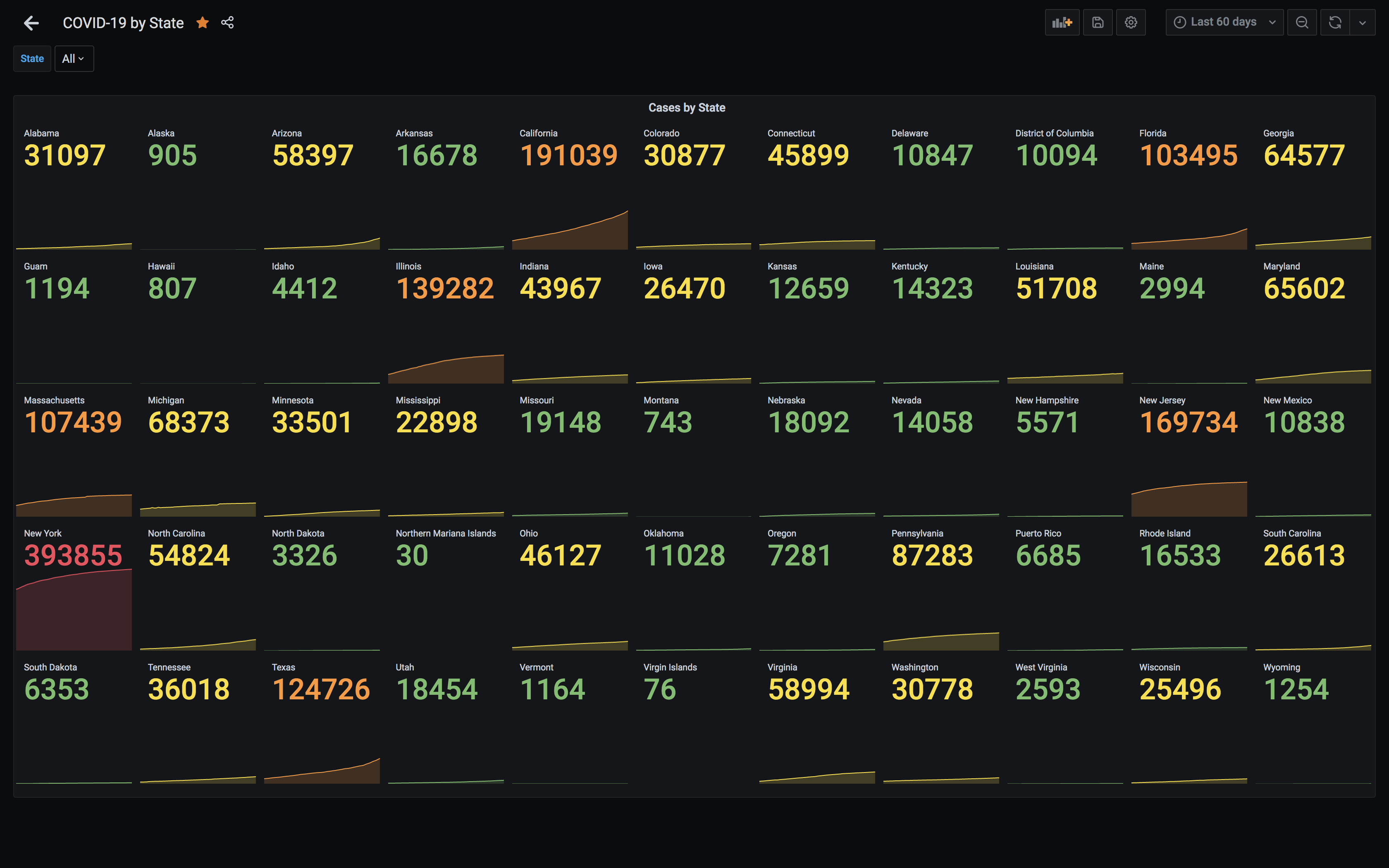
I wanted to provide a way for people to visualize the impact of COVID-19 in the US over time with the New York Times COVID-19 dataset. I wanted this to be public, easy-to-use, and using off-the-shelf tools. With those requirements, I decided to pipe the time-series data into InfluxDB and visualize it with Grafana.
A few notes on the underlying data:
More details, methodology, and definitions can be found at the New York Times COVID-19 data repository.
Built using Grafana, InfluxDB, and csv-to-influxdb. Data from New York Times. Running on AWS, managed by Terraform.
Project site available here.
Source available on Github.